12 Essential Pages Every New Blog Should Publish
A blog with twelve solid pages up front saves you hours of scrambling later. Readers land, get oriented, and trust you faster because the basics are already handled.
You don't need a designer or a developer to pull this off. Most of these pages take twenty minutes each and quietly do heavy lifting for years.
From your homepage to a friendly 404, each one earns its spot by answering a real question visitors bring with them. Skip the guesswork and build the set once, properly.
Free PDF Download
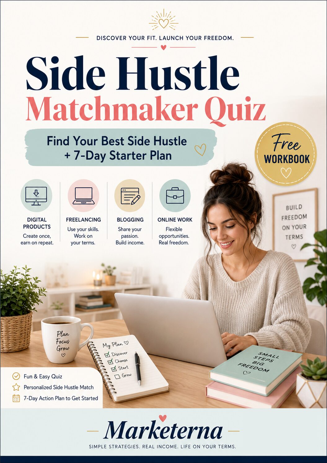
Not Sure Which Side Hustle Fits You Best?
Take the free Side Hustle Matchmaker Quiz and get a simple 7-day starter plan to help you choose a beginner-friendly idea based on your time, skills, comfort level, and goals.
You’ll get this free PDF plus access to the full Marketerna Save More & Earn More PDF Kit. No spam. Unsubscribe anytime.
1. Homepage: Your Blog's Front Door
Your homepage is the first thing most visitors see, so it needs to work like a friendly greeter. It should quickly tell people what your blog is about and where to go next. A cluttered or confusing homepage sends readers away before they give your content a chance.
Think of it as the lobby of a building. You want clear signs, a welcoming vibe, and an easy path to the rooms that matter. When someone lands on your homepage, they should instantly feel oriented and curious to explore.
You don't need fancy animations or a complex layout. A clean headline, a few featured posts, and straightforward navigation will do the job. Get this page right, and everything else becomes easier to discover.
Your homepage sets the tone for the entire blog. It answers the silent question every visitor asks: 'Am I in the right place? ' If the answer is yes, they stick around. If it's unclear, they bounce.
A strong homepage does three things: it states your blog's purpose, highlights your best content, and makes navigation obvious. You can achieve all of that with a simple layout that puts the important stuff front and center. Keep it uncluttered.
White space is your friend. The goal is to guide, not overwhelm.
Craft A Clear Headline
Your headline should tell visitors exactly what your blog offers. Avoid vague slogans or inside jokes that only you understand. A simple, descriptive line like 'Practical tips for new gardeners' works better than 'Growing together. ' Place it prominently at the top, and make sure it's readable on mobile.
If someone has to squint or guess, you've lost them.
Showcase Featured Posts
Pick three to five of your best or most popular posts and display them with eye-catching images and clear titles. These act as samples of what your blog delivers. Rotate them occasionally to keep the homepage fresh.
You can also highlight a 'Start Here' post for new readers who want a guided introduction.
Make Navigation Effortless
Your menu should be simple and intuitive. Stick to the essentials: Home, About, Blog, and Contact. If you have categories, keep them broad and easy to scan.
Don't bury important links in dropdowns or footers. Visitors should find what they need without thinking. A search bar can also help if your blog has a lot of content.
2. About Page: Show the Human Behind the Blog
Blogs run by real people beat anonymous content farms every time. Your About page is where strangers decide whether you're worth following, and a blank or robotic one gives them zero reason to stay. People want to know who's typing.
They want a face, a reason, and a sense that someone with actual opinions stands behind the words. Give them that, and they'll come back.
The About page isn't a resume. It's a handshake. Keep it warm, short, and honest enough that a reader finishes it feeling like they've met you.
Tell Your Origin Story
Explain what made you start this blog. Maybe you got tired of bad advice, solved a problem the hard way, or just wanted a place to think out loud. A few sentences is plenty.
Skip the timeline of your life and focus on the moment that pushed you to hit publish.
Add A Real Photo
A clear headshot does more than any clever tagline. It doesn't need to be professional, just current and recognizable. Readers trust a face.
Use one where you look like yourself, not a stock model staring into the middle distance.
Say Who It's For
Tell visitors who benefits from reading your stuff. New runners? Freelance designers?
Parents cooking on a budget? When someone sees themselves in that sentence, they subscribe. When they don't, they leave, and that's fine too.
Give Them A Way To Reach You
Drop an email address or a contact link. A simple line like "Questions? Email me" works.
You don't have to promise instant replies. Just show that a human is on the other end.
Free PDF Download
Not Sure Which Side Hustle Fits You Best?
Take the free Side Hustle Matchmaker Quiz and get a simple 7-day starter plan to help you choose a beginner-friendly idea based on your time, skills, comfort level, and goals.
You’ll get this free PDF plus access to the full Marketerna Save More & Earn More PDF Kit. No spam. Unsubscribe anytime.
3. Contact Page: Make It Easy to Reach You
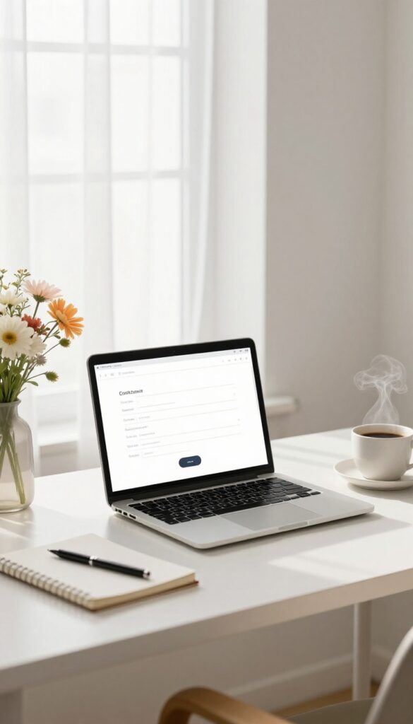
A contact page is one of those quiet pages that does more than it looks like it does. It tells readers a real person is behind the blog, and it gives them a clear way to say hello, ask a question, or pitch a collaboration. You don't need anything fancy here.
A simple form or a visible email address is enough to get the job done. The goal is to remove friction. If someone has to hunt for your email or fill out five fields, most people just close the tab and move on.
Keep The Form Short
Ask for a name, an email, and a message. That's it. Every extra field you add drops the number of people who actually hit send.
If you worry about spam, add a simple captcha or a honeypot field instead of piling on questions. Readers won't notice the difference, but your inbox will.
Show A Real Email Too
Some people hate forms and would rather write to you directly. Put a plain email address on the page so they have that option. You can format it like name (at) yourdomain (dot) com to slow down scrapers, or use a contact-specific address so your main inbox stays clean.
Set Expectations Up Front
Tell people when they can expect a reply. Something like "I read every message and usually respond within two days" goes a long way. It also gives you room to breathe.
If a week passes before you answer, no one feels ignored because you already told them what to expect.
Add Links For The Right Reasons
If you take guest posts, sponsorships, or speaking requests, mention it here with a short note. That saves everyone a round of back-and-forth emails. Skip the long list of social icons unless they're actually active.
A dead link to an abandoned profile hurts more than it helps.
4. Blog Archive: Organize Your Posts
An archive page is your blog's back catalog, neatly shelved. It lists every post you've published, usually by date or category, so readers can see everything you've written without digging through menus. Without one, your older posts get buried fast.
New visitors only see your latest three articles and assume that's all there is. An archive fixes that by giving them a clear path to binge your best work. It also keeps people on your site longer.
The more they click, the more they read, and the more likely they are to subscribe or share.
An archive page is your blog's back catalog, neatly shelved. It lists every post you've published, usually by date or category, so readers can see everything you've written without digging through menus. Without one, your older posts get buried fast.
New visitors only see your latest three articles and assume that's all there is. An archive fixes that by giving them a clear path to binge your best work. It also keeps people on your site longer.
The more they click, the more they read, and the more likely they are to subscribe or share.
Pick A Layout That Fits Your Content
Chronological works great for news or personal blogs where timeliness matters. Category-based shines for niche sites with clear topics, like recipes or travel guides. You can also combine both: show categories first, then list posts under each.
Make It Easy To Scan
Use clear headings, short excerpts, and maybe a thumbnail image for each post. Group by month or year if you have a lot of content. The goal is to help readers spot something interesting in seconds, not make them work for it.
Link It From Your Main Menu
An archive page nobody finds does nothing. Add it to your navigation bar or footer so it's always one click away. You can also link to it from your about page or at the end of popular posts.
Free PDF Download
Not Sure Which Side Hustle Fits You Best?
Take the free Side Hustle Matchmaker Quiz and get a simple 7-day starter plan to help you choose a beginner-friendly idea based on your time, skills, comfort level, and goals.
You’ll get this free PDF plus access to the full Marketerna Save More & Earn More PDF Kit. No spam. Unsubscribe anytime.
5. Start Here Page: Guide New Readers

Most new visitors don't know where to begin. A Start Here page solves that by giving them a clear path instead of a confusing pile of posts. Think of it as a welcome mat with directions.
You pick your best articles, arrange them in a logical order, and tell readers exactly what to read first, second, and third. This one page turns casual browsers into engaged fans. It's the difference between a visitor who bounces and one who subscribes.
A Start Here page works because it respects your reader's time. Instead of making them hunt for value, you hand it to them on a platter. That small gesture builds trust fast.
You don't need fancy design. A simple list with short descriptions does the job. The goal is clarity, not perfection.
Pick Your Best 5-7 Posts
Choose articles that represent your core message. These should be your most helpful, most popular, or most foundational pieces. Don't include everything.
A tight list is easier to digest and makes each post feel more valuable.
Order Them Like A Story
Arrange your posts in a logical sequence. Start with the biggest problem your reader has, then guide them toward the solution step by step. This turns random reading into a journey.
Readers feel progress, and progress keeps them coming back.
Add A Short Blurb For Each
Write one or two sentences explaining why each post matters. Tell readers what they'll learn or how it helps. This small detail makes your list scannable and gives people a reason to click.
Include A Clear Call To Action
End your Start Here page with a next step. Invite readers to subscribe, join your newsletter, or follow you on social media. A simple prompt like 'Get new posts in your inbox' works better than a vague 'Thanks for reading. '
6. Privacy Policy: Stay Legal and Transparent
If your blog collects any data at all—even just an email address for comments—you likely need a privacy policy. Laws like GDPR and CCPA require it, and readers appreciate knowing you won't sell their info. A clear policy builds trust and keeps you out of legal trouble.
A privacy policy explains what data you collect, why you collect it, and how you handle it. It covers cookies, analytics, email signups, and third-party tools. You don't need a lawyer to write one; plenty of free generators exist.
Just make sure it's accurate and easy to find, usually in your footer.
What To Include
List the types of data you gather, like names, emails, or IP addresses. Explain how you use it, whether you share it, and how long you keep it. Mention any third-party services like Google Analytics or Mailchimp.
Also include how users can contact you to request deletion.
Where To Put It
Link to your privacy policy in the footer of every page. That's the standard spot readers and regulators expect. You can also mention it near signup forms or comment sections.
A direct link in your main menu works too if you want extra visibility.
Keeping It Current
Update your policy whenever you add new tools or change how you use data. Date the page so readers know it's fresh. A quick review once a year keeps you compliant.
If you're unsure, a simple template from a trusted source is fine.
7. Terms and Conditions: Set the Rules

Your blog is your space, but once you invite comments, guest posts, or downloads, you need a few ground rules. A Terms and Conditions page spells out what visitors can and can't do on your site. It's not about being unfriendly—it's about being clear so everyone knows what to expect.
Think of it as a friendly handshake that also protects your work. You're telling people how they can use your content, what happens if they break the rules, and where you stand legally. It might feel like overkill for a small blog, but it's actually a smart move that takes very little time.
What To Include
Start with the basics: who owns the content, how people can share it, and what they can't do (like republishing without permission). Add a note about comments—what's allowed and what gets deleted. If you sell anything, include payment and refund terms.
And always mention that you can change the terms later.
Why It Matters
Without terms, you leave yourself open to misuse. Someone could copy your posts, claim them as their own, or spam your comments with no recourse. A simple terms page gives you a way to say 'that's not okay' and back it up.
It also shows you're professional and serious about your blog.
Keep It Readable
You don't need a lawyer to write this. Use plain language and short sentences. Avoid jargon that makes people's eyes glaze over.
A clear, honest terms page builds trust—it doesn't scare people away.
8. Disclaimer: Be Clear About Your Content

The moment you start sharing advice, reviewing products, or giving your honest take on something, you're putting your opinion out into the world. That's great for your readers, but it also means you're taking on a bit of risk. A simple disclaimer page makes it clear where you stand and what readers can expect from your content.
A disclaimer isn't about scaring people off. It's about being upfront so nobody feels misled later. Think of it as a friendly heads-up that keeps you and your readers on the same page.
When You Actually Need One
If you write tutorials, recommend products, or share personal experiences, a disclaimer is smart. It tells readers your advice is based on your own knowledge, not professional expertise they should bet their business on. If you earn money through affiliate links or sponsorships, you're often required to disclose that anyway.
What To Include
Keep it plain and honest. State what your blog covers, that your opinions are your own, and that readers should do their own research before making decisions. If you use affiliate links, say so clearly.
If you talk about health, finance, or legal topics, add a line that you're not a licensed professional.
Where To Put It
A dedicated disclaimer page linked in your footer works for most blogs. For specific posts, like a detailed product review, a short note at the top or bottom of the post helps too. That way readers see it right where it matters most.
9. Resources Page: Share Your Favorite Tools
A resources page is where you tell readers what you actually use. It's not a sales pitch; it's a helpful shortcut. You list the tools, books, and services that make your blog run, and readers get a trusted starting point.
It also happens to be one of the easiest pages to monetize. When you recommend something you genuinely like, adding an affiliate link is a natural next step. You earn a little, and your reader saves time researching.
Done right, this page feels like a favor, not an ad. Keep it honest, keep it updated, and it'll quietly earn its keep.
A resources page works because people trust recommendations from someone who's already done the trial and error. You're not just listing products; you're sharing what solved a real problem for you. Start with the stuff you use daily.
Your hosting, your email tool, your design software, the books that shaped how you work. If you've used it for months and still like it, it belongs on the list. Keep the format simple.
A short category, the name of the tool, one line on why you use it, and a link. That's it. No need for long reviews unless you want to write them.
Update it every few months. Tools change, prices change, and your favorites might change too. A stale resources page loses trust fast.
What To Include (and What To Skip)
Include anything you'd recommend to a friend without hesitation. Hosting, scheduling tools, stock photo sites, books, courses, even your camera gear if you're a photographer. Skip the stuff you barely use or only signed up for because of a bonus.
Readers can smell a filler recommendation. If you wouldn't vouch for it, leave it off. A good rule: if you can't say why you use it in one sentence, it doesn't make the cut.
How To Add Affiliate Links Without Being Pushy
Disclose it clearly at the top of the page. Something like, "Some links below are affiliate links, which means I earn a small commission at no extra cost to you. " That's enough.
Then just link naturally. You don't need a hard sell. If your one-line reason is honest, the link does the rest.
Only link to products you've actually used. Trust is the whole point of this page, and it's hard to get back once it's gone.
Make It Easy To Scan
Use short category headings like "Blogging Tools, " "Books, " or "Design. " Under each, list your picks with a bolded name and a quick note. Add a link to each tool right in the description.
Don't make readers hunt for it. If you have a lot of resources, consider a simple table or a two-column layout. But plain lists work fine too.
Clarity beats fancy every time.
10. Newsletter Page: Grow Your Email List

Social media feeds move fast, but an email list is yours to keep. A dedicated newsletter page gives readers a clear reason to hand over their address and a simple way to do it. It also signals that you plan to stick around and keep delivering value.
Most bloggers wait too long to start collecting emails. By the time they realize they need a list, they've lost months of potential subscribers. A newsletter page fixes that by turning casual readers into a community you can reach anytime.
You don't need a fancy funnel or automation sequence. A simple page with a short pitch and a signup form works wonders. The key is making the benefit obvious and the action effortless.
Why Email Beats Social
Algorithms change, accounts get locked, and reach drops without warning. Email doesn't play those games. When someone subscribes, you have a direct line to their inbox.
That's why smart bloggers treat their list as their most valuable asset.
What To Put On The Page
Start with a headline that says exactly what subscribers get. Then add a short paragraph explaining how often you'll email and what kind of content they can expect. Finally, embed your signup form right there—don't make people hunt for it.
Make Signing Up A No-brainer
Offer a small incentive like a free checklist, ebook, or exclusive tips. It doesn't have to be huge—just something that shows you're serious about delivering value. And always reassure readers that you won't spam them or sell their email.
11. Testimonials or Press Page: Show Social Proof
People trust other people more than they trust you. That's just how it works. A testimonials or press page gives new visitors a reason to believe you before they've read a single post.
You don't need a wall of logos or a hundred glowing reviews. A handful of honest quotes from readers, clients, or fellow bloggers can do the job. It's one of the easiest pages to build and one of the most persuasive.
Think of it as borrowing credibility until you've earned your own. When someone lands on your blog for the first time, they're quietly asking, "Is this person worth my time? " A few real voices answering that question makes the decision much easier.
You can collect testimonials in a few simple ways. Ask happy readers after a helpful email exchange. Reach out to clients you've worked with.
Or screenshot a nice comment someone left on your post. Always ask permission first, and keep it casual. Press mentions work the same way.
If a podcast invited you on, or a bigger blog linked to your work, that's worth showing off. Even small nods add up.
Where To Find Good Quotes
Check your inbox for thank-you notes. Look at comments on your most helpful posts. Ask a few loyal readers directly.
People are usually happy to say something nice when you make it easy for them.
How To Display Them Without Looking Cheesy
Keep it clean. Use real names and photos when you can. Avoid generic praise like "Great blog!
" and pick quotes that mention a specific result or feeling. One strong quote beats five vague ones.
When To Update The Page
Add new testimonials every few months. Remove anything that feels outdated or no longer matches your focus. A fresh quote from last week carries more weight than one from three years ago.
12. 404 Page: Turn Errors into Opportunities

Broken links happen. Someone bookmarks an old post, a search engine indexes a dead URL, or a reader mistypes your domain. When that happens, they land on your 404 page, and what they see next decides whether they stick around or leave for good.
A lazy 404 page just says "not found" and calls it a day. A smart one treats the moment like a second chance. It apologizes, points people somewhere useful, and keeps the visit alive.
You don't need anything fancy. A short message, a search bar, and a few links to your best stuff will do the job better than most blogs bother to.
Most bloggers set up a 404 page once and forget it. That's a mistake, because error pages get more traffic than you'd think. Every dead link sends someone there, and those visitors already wanted something from you.
A good 404 page does three things: it admits the mistake, it helps the reader find what they came for, and it gives them an easy way back into your site. That's it. No long apology, no confusing jargon, no dead end.
Keep the tone light and on-brand. If your blog is funny, be funny. If it's calm and practical, stay calm and practical.
The goal is to make a small frustration feel like no big deal.
Write A Message That Sounds Like You
Skip the robotic "Error 404: Page Not Found" if you can. A simple line like "Well, this page took a wrong turn" or "We can't find that one" works fine. Add a sentence or two explaining that the link may be old or broken, then move straight to the fix.
Give Them Somewhere To Go
Link to your homepage, your most popular posts, and your search bar. Three to five links is plenty. If you have a contact page, mention it so readers can tell you about the broken link.
That turns a dead end into a conversation.
Test It Before You Forget It
Type a random URL on your site to see your 404 page in action. Check that it loads fast, looks right on your phone, and that every link actually works. A broken 404 page is a special kind of irony you don't want.
FAQ
Do I really need all 12 pages on day one?
No. Start with the essentials: Homepage, About, Contact, and Privacy Policy. Add the rest as your blog grows.
How long should each page be?
It varies. About and Start Here can be longer, while Contact and 404 pages are short. Focus on clarity, not word count.
Can I use templates for legal pages?
Yes, but customize them to your blog's specific needs. Free generators exist, but a lawyer review is best if you're unsure.
What if I don't sell anything? Do I still need a disclaimer?
Yes, especially if you share advice or opinions. A simple disclaimer protects you and sets reader expectations.
How do I make these pages look good?
Use your blog's theme and keep formatting consistent. Short paragraphs, clear headings, and a few images go a long way.
Conclusion
Get these twelve pages live and your blog stops looking like a placeholder. Visitors find their way around, trust what they read, and actually stick around long enough to subscribe. Don't wait for perfect copy either.
Publish solid versions now, then refine as you learn what your readers need. Those first pages do the quiet work that turns casual clicks into a real audience.
Free PDF Download
Not Sure Which Side Hustle Fits You Best?
Take the free Side Hustle Matchmaker Quiz and get a simple 7-day starter plan to help you choose a beginner-friendly idea based on your time, skills, comfort level, and goals.
You’ll get this free PDF plus access to the full Marketerna Save More & Earn More PDF Kit. No spam. Unsubscribe anytime.